Same scarf. A whole new feeling.
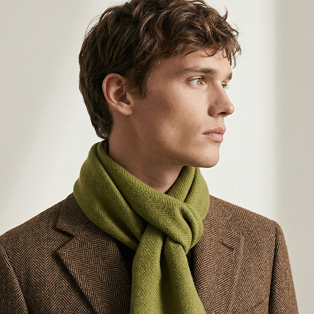
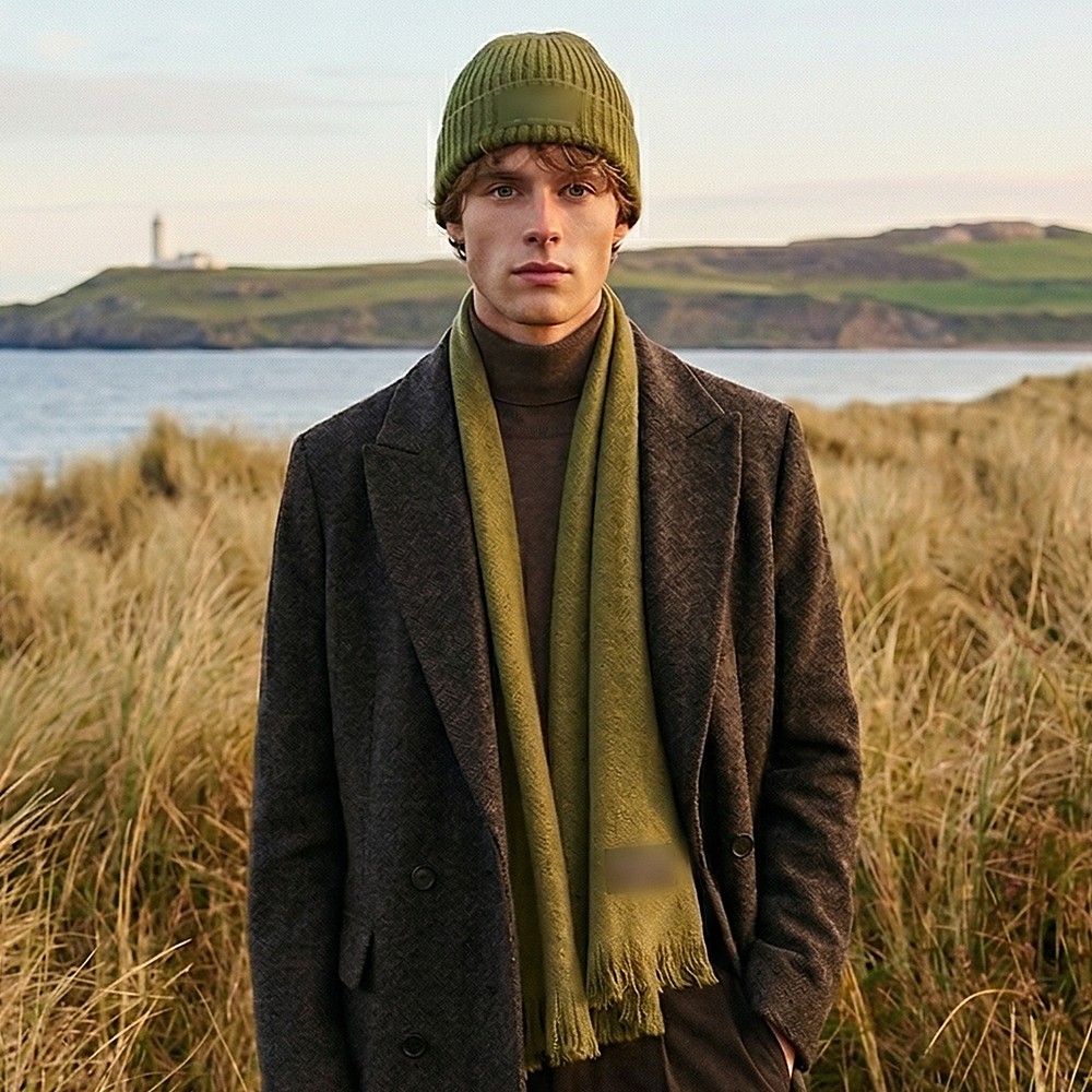
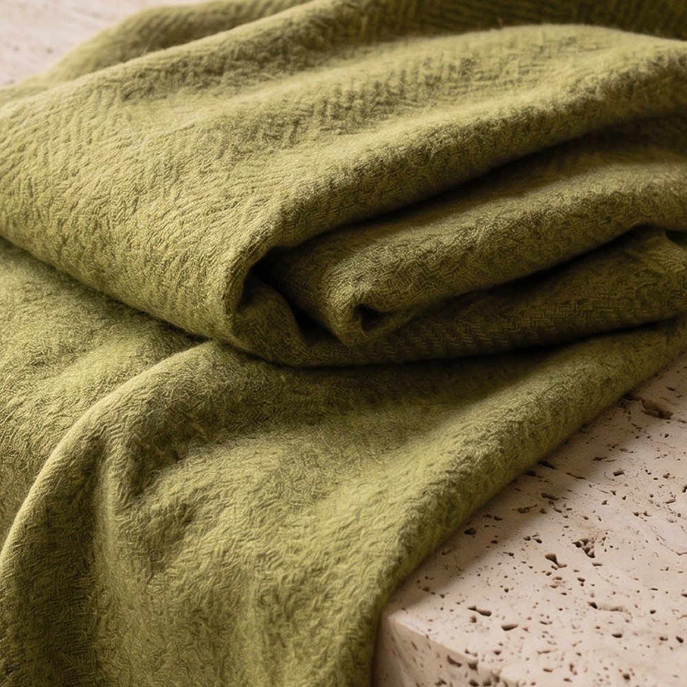
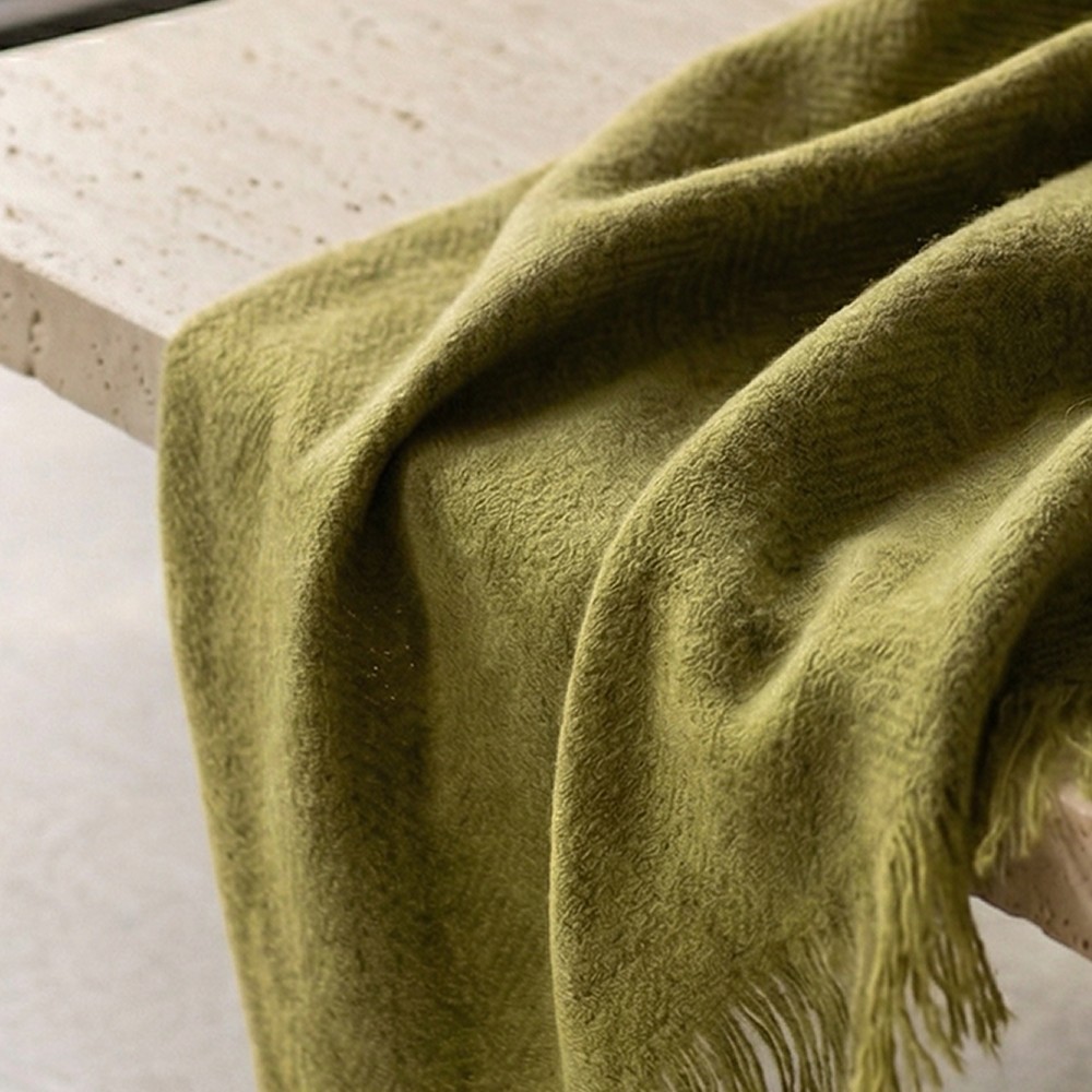
A heritage alpaca label with a beautiful product and an image that didn't do it justice. Here's the revamp we proposed, and the campaign we created to show it.
A premium product, shot like a catalogue.
The original photos did their job: clear, bright and focused on the product. But flat lighting and stark white backgrounds hid what makes alpaca special. With a bold colour like olive green, plain photography made the product feel flat and harder to picture wearing.
- Flat, even studio lighting
- Cold white shirts and plain backdrops
- Nothing that showed how soft it feels

Original brand assets blurred for confidentiality.
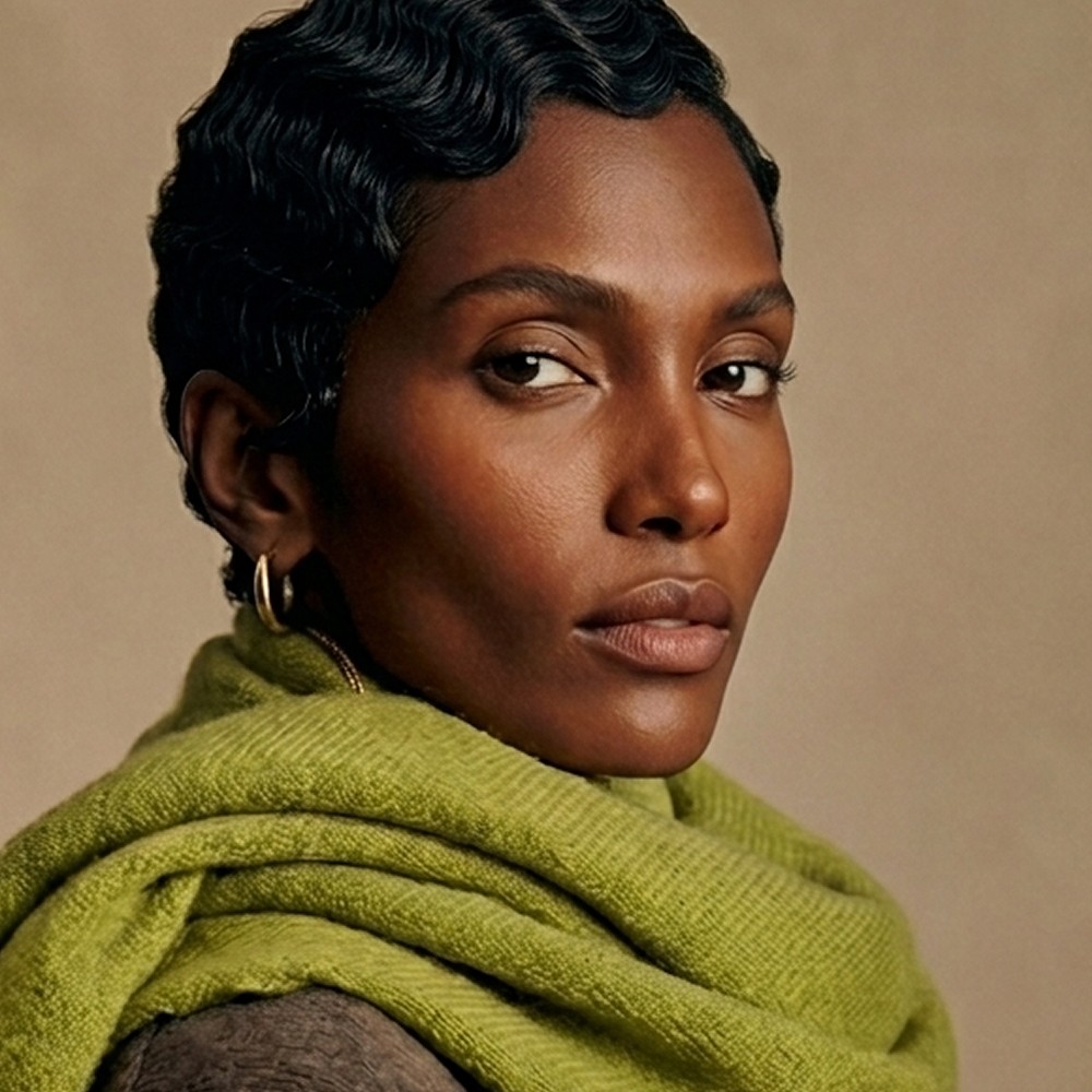
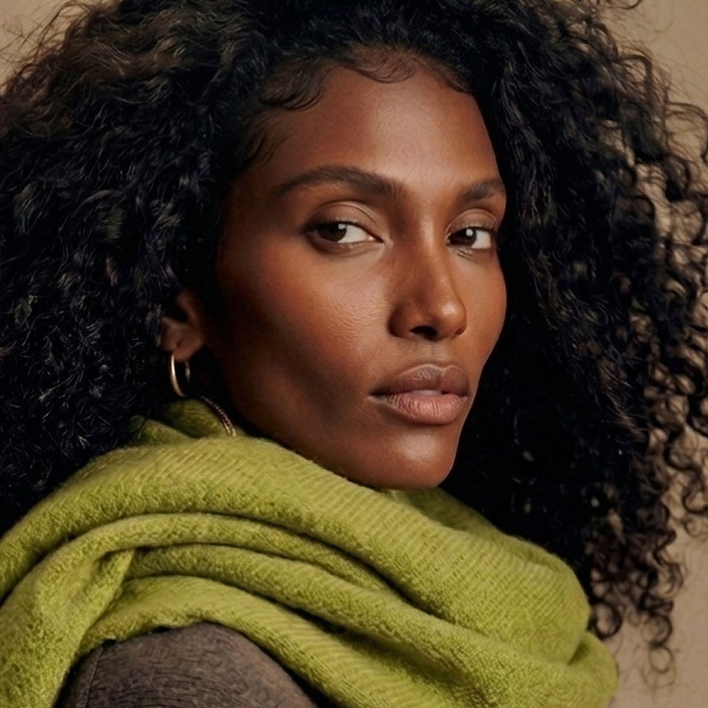
Let the colour be seen at its best.
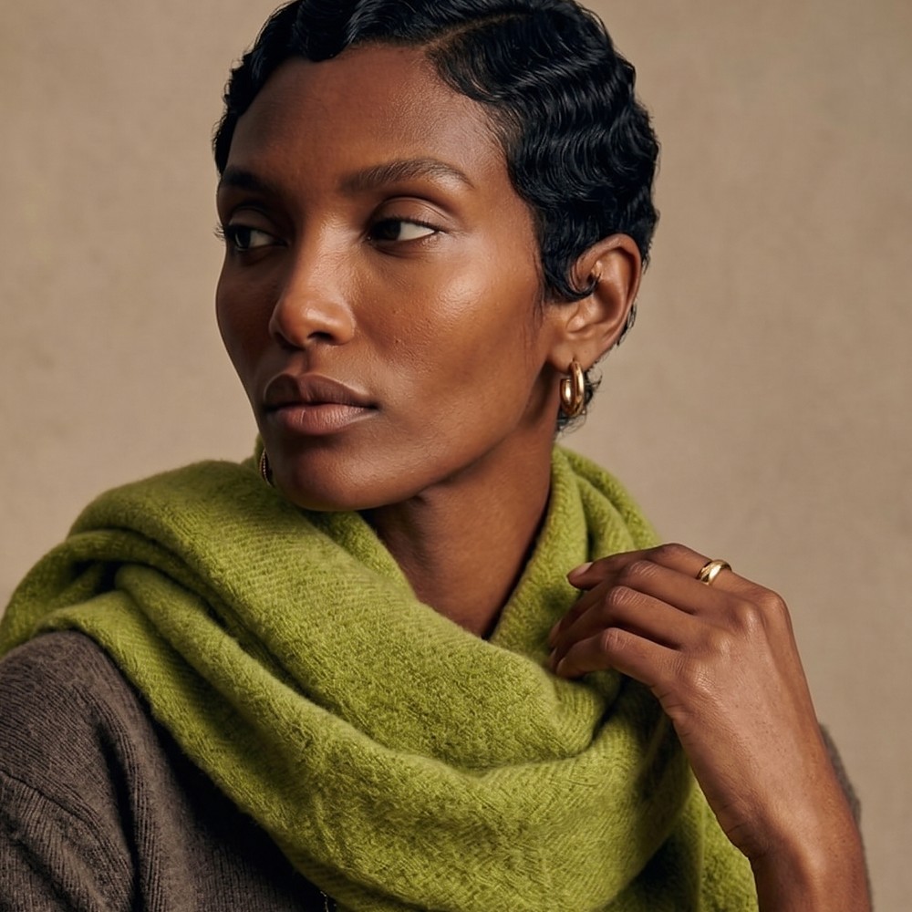
Olive green is a bold colour with real character. In the original photos it looked flat and dull. In the right light, next to warm tones, it becomes the piece you want to wear.
- 01Feel it through the screen
Close, textured shots that make the softness obvious before anyone touches it.
- 02Warm tones, not white shirts
Brown tweeds and charcoals bring out the depth of the green, so it reads as a luxury neutral.
- 03An investment piece, not an accessory
Images that sell warmth and quiet luxury, not just a scarf.
Warm tones, real texture.
Rich browns and soft natural light let the green do the talking.
What changed
Great product, tired image?
Work with usReady to be seen?
Tell us about your brand and we'll show you exactly where you stand, and what we'd do first.
- SEO and site health check
- AI visibility check
- Paid social and PPC opportunities
- A 90-day priority plan