East Space: a hand-printed brand, and a site that books.
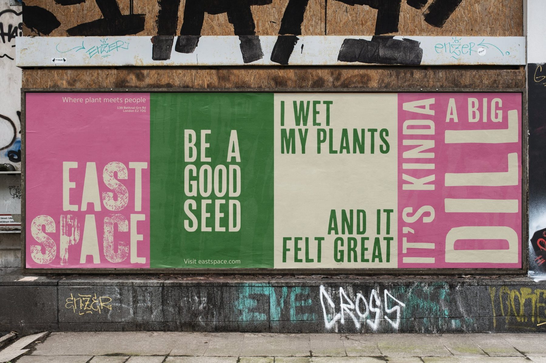
A brand identity and website for a start-up urban gardening centre in East London. A space to learn, connect and share ideas.

Everyone could use a little bit of green in their lives.
East Space is a community gardening centre for people who live in flats, above shops and on busy roads. It runs hands-on workshops, sells plants and tools, and opens its garden to volunteers.
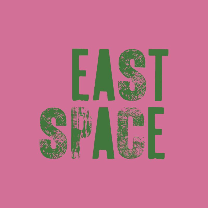
The identity needed to feel handmade and a bit cheeky, never like a garden-centre chain. So every letter of the logo was hand-printed with vintage wood type, and the rollout leans on bold colour and terrible plant puns.
Years later, we went back to the original website mockup and rebuilt it the way we would for a client today: keep everything that makes the brand, and fix everything that stops people booking.
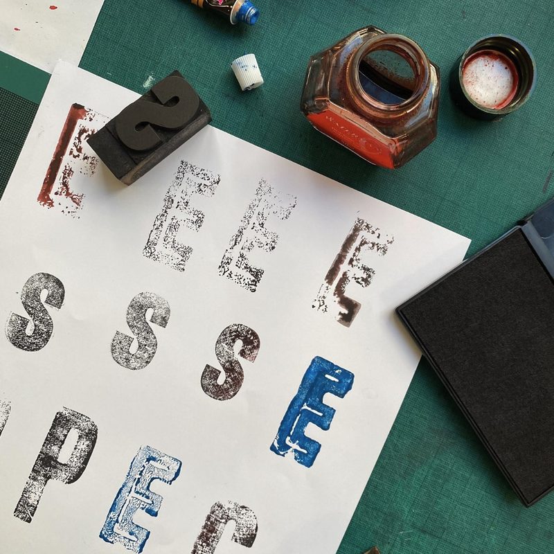
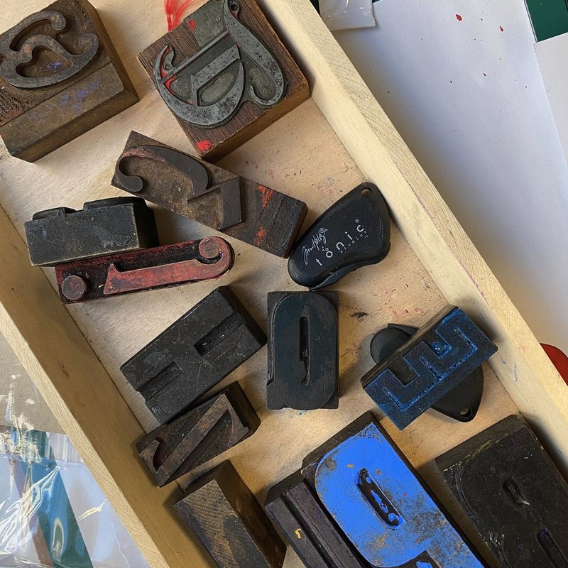
Made by hand, letter by letter.
Each character was inked and stamped from vintage wood and metal type, then scanned so the texture of the press stays in every application.
Bebas Neue for headlines and puns, Work Sans for friendly body copy.
Same brand. A site that books.
The original mockup looked lovely but asked visitors to guess: no dates, no prices, no opening hours, and a sign-up form that wanted a password. Our review found 18 issues, and the new design fixes 15 of them.
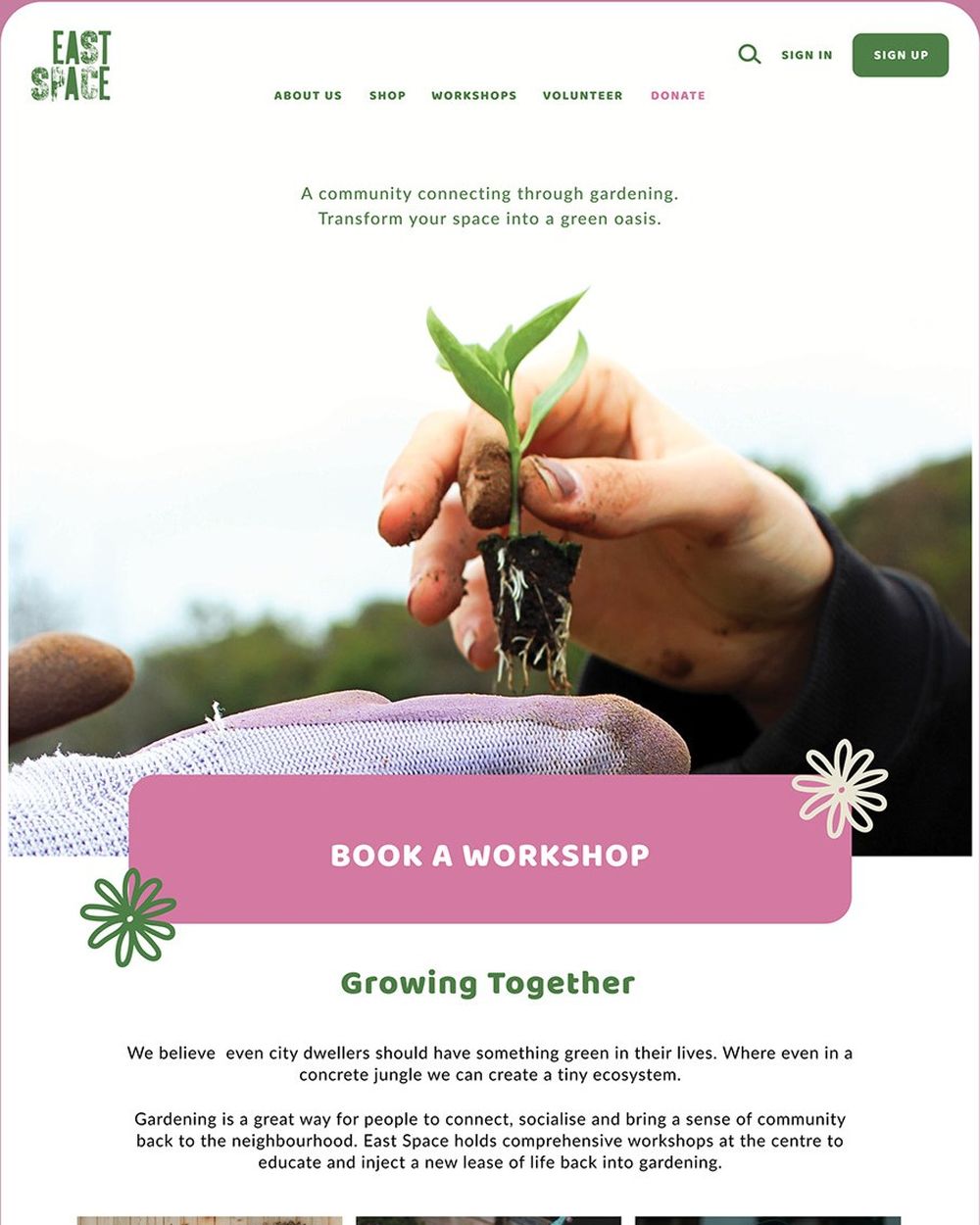
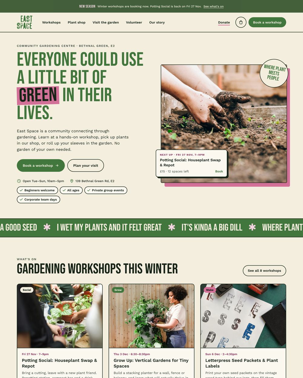
What changed, and why.
- A promise above the fold
The brand line became the H1, with the location, two clear buttons and who it's for: beginners, all ages, private and corporate groups.
- Workshops you can actually book
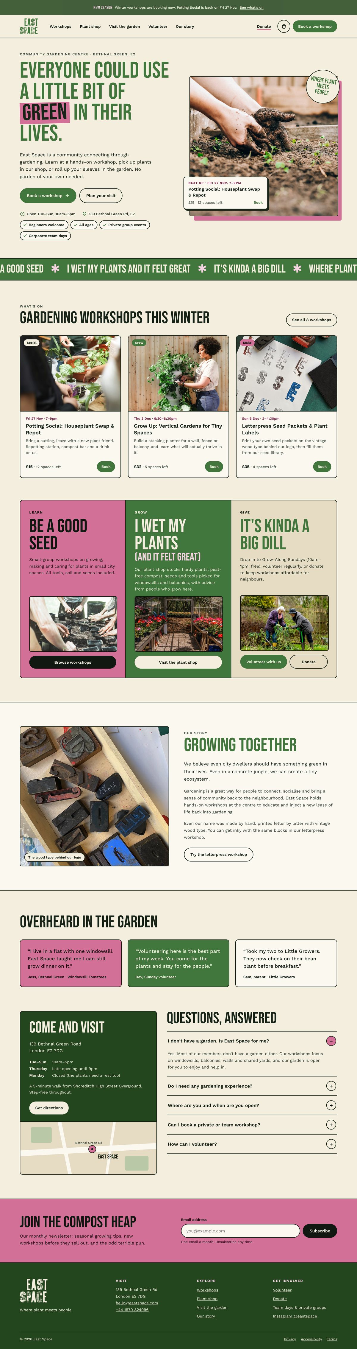
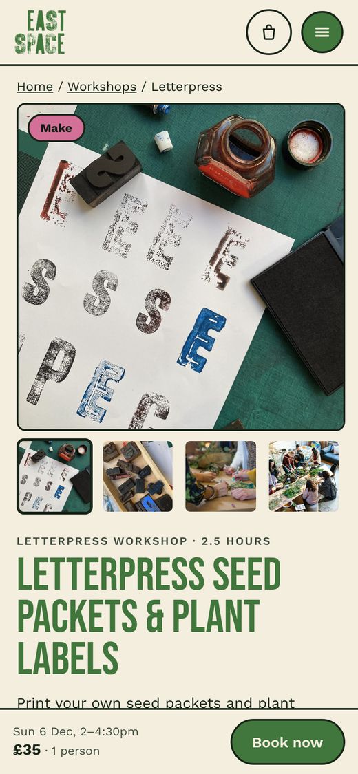
Dated cards with price and spaces left, a filterable listing and a booking page with date picker, quantity and basket.
- The posters, brought online
Letterpress-style headlines, cream, and the puns now headline the Learn, Grow and Give routes and run in a marquee.
- Trust for a real place
Opening hours, directions, step-free access, reviews and FAQs that answer "I don't have a garden. Is this for me?"
- Lower-effort sign-up
The four-field account form became an email-only newsletter, "The Compost Heap", with a clear reason to join.
- Built for phones
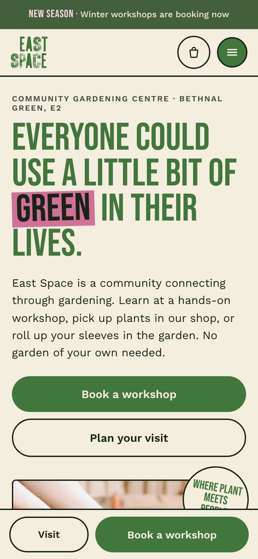
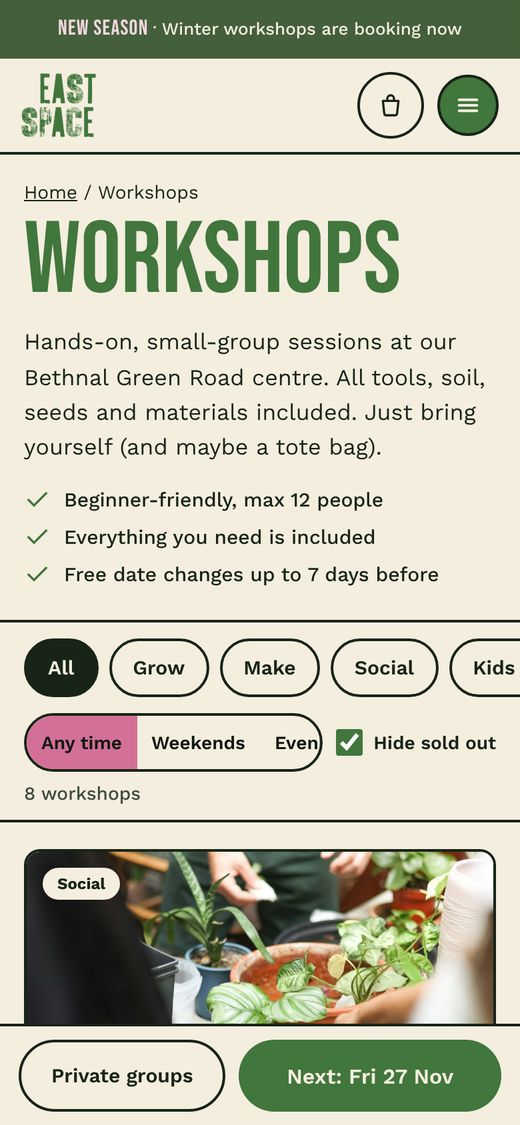
A full-screen menu, tappable filters, swipeable rows and a sticky bar with price and Book on every page.
Rebuilt around booking a workshop.
We kept the hand-printed logo, pink and green palette and poster puns, then rebuilt the pages for conversion: home, workshops and a full booking page.

In your pocket.
The same pages, copy and photos as desktop, rebuilt for booking on a phone.
It's kinda a big dill. Want a site like this?
Work with usReady to be seen?
Tell us about your brand and we'll show you exactly where you stand, and what we'd do first.
- SEO and site health check
- AI visibility check
- Paid social and PPC opportunities
- A 90-day priority plan